Why Every Logo Needs a System, Not Just a Mark
A logo is 10% of a brand identity. Here's the system I build around every mark — and why clients feel the difference.
By Tharaka Jay · October 12, 2026 · 6 min read
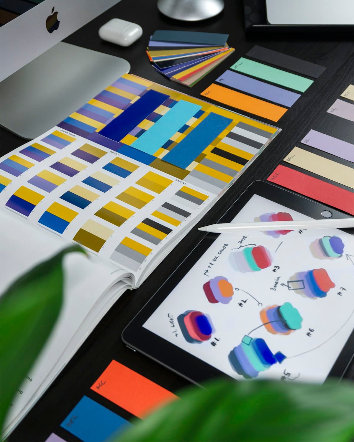
Most clients come to me asking for 'a logo'. What they actually need is a system — a small, disciplined set of rules that makes the logo work everywhere: a favicon, a shop signboard, a book cover, a social avatar. A mark without a system is decoration. A mark inside a system is a brand.
The mark is the easy part
Sketching a clever mark feels like the job, but it's maybe a tenth of it. The real work starts when you ask: what does this look like in one colour? At 16 pixels? Embroidered? Inverted on a photo? If the answer is 'it breaks', you don't have a logo yet — you have an illustration.
The four layers I always deliver
- The mark + wordmark lockups — primary, stacked, and icon-only versions.
- Typography pairing — one display face, one workhorse, with rules for when to use each.
- Colour system — built separately for screen (RGB) and print (CMYK), because they are genuinely different media.
- Usage rules — clear space, minimum sizes, and the five things you must never do to the logo.
A brand guideline isn't bureaucracy. It's the reason a logo still looks like itself three years later.
Why clients feel the difference
When a client gets a system instead of a file, their designer (me, or whoever comes next) stops guessing. Social posts look related to the packaging. The website feels like the signboard. That consistency is what people read as 'professional' — and it's entirely manufactured by the system, not by the mark.